The 9 Castles Brand and Product Design
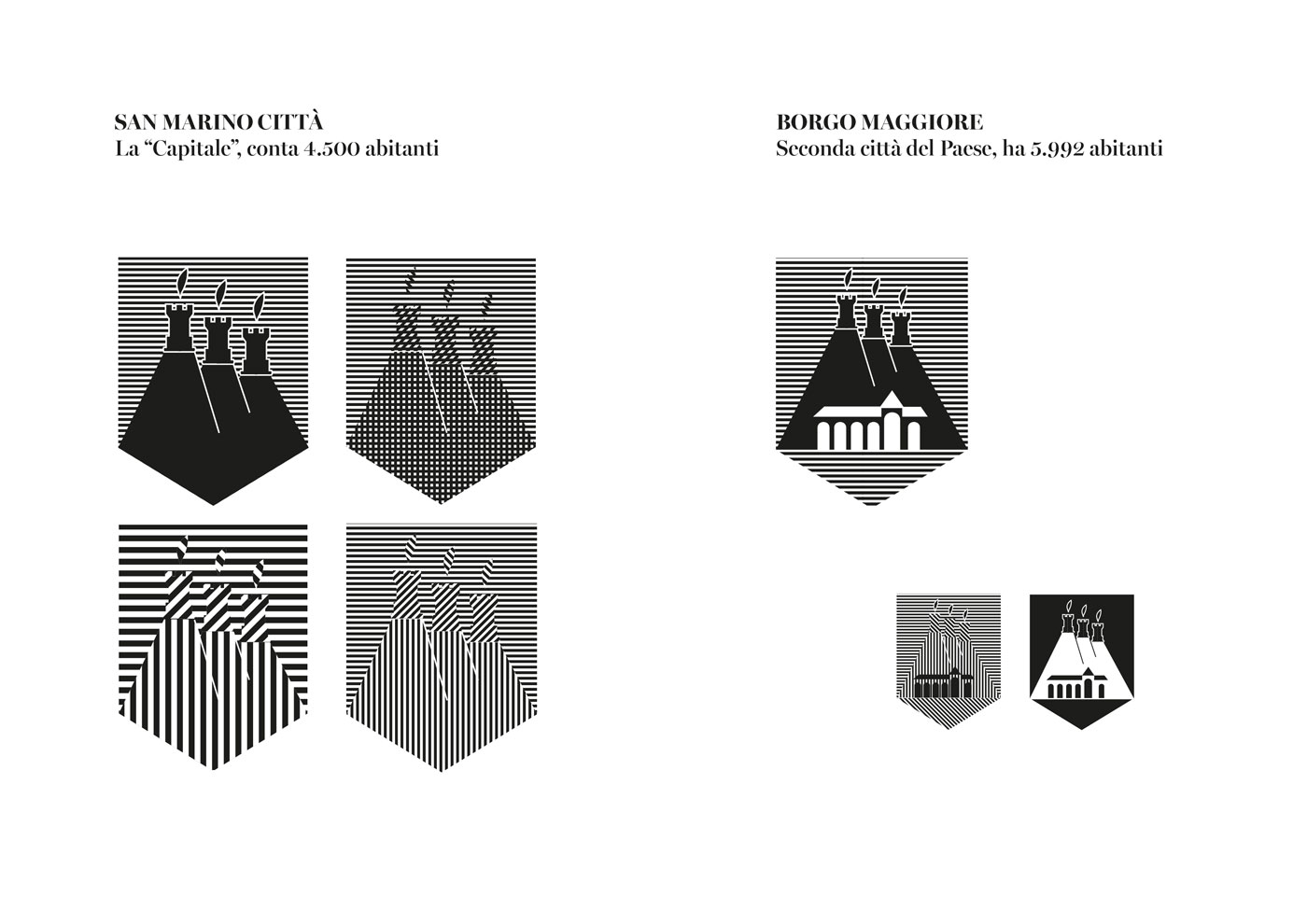
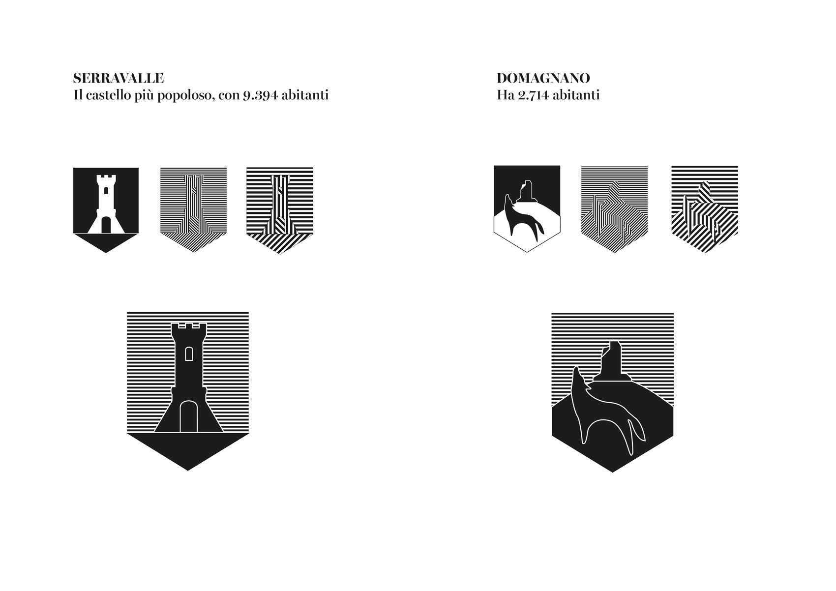
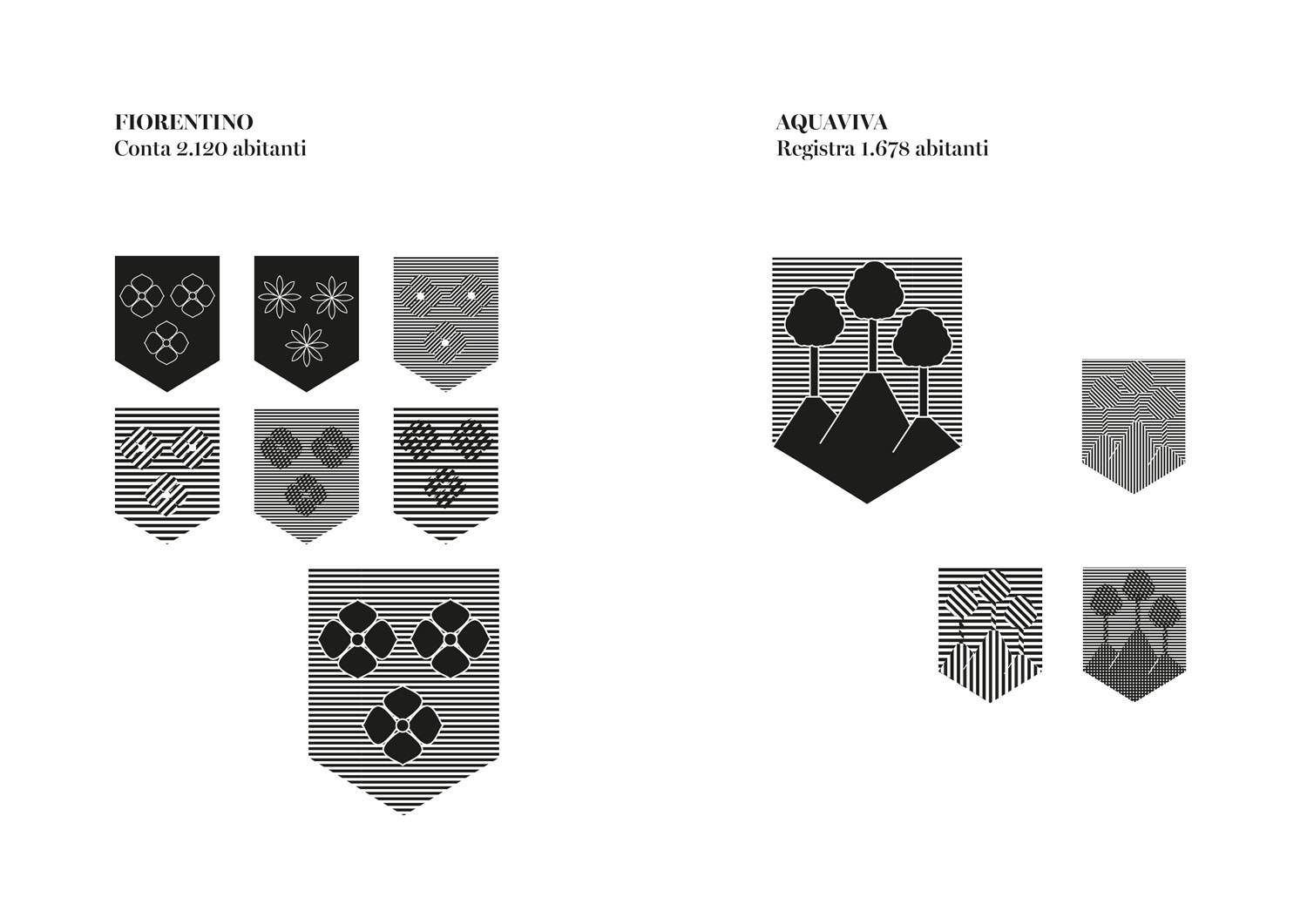
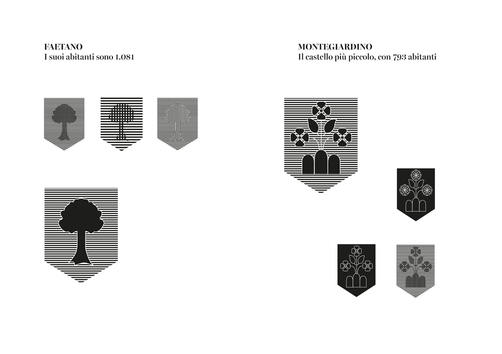
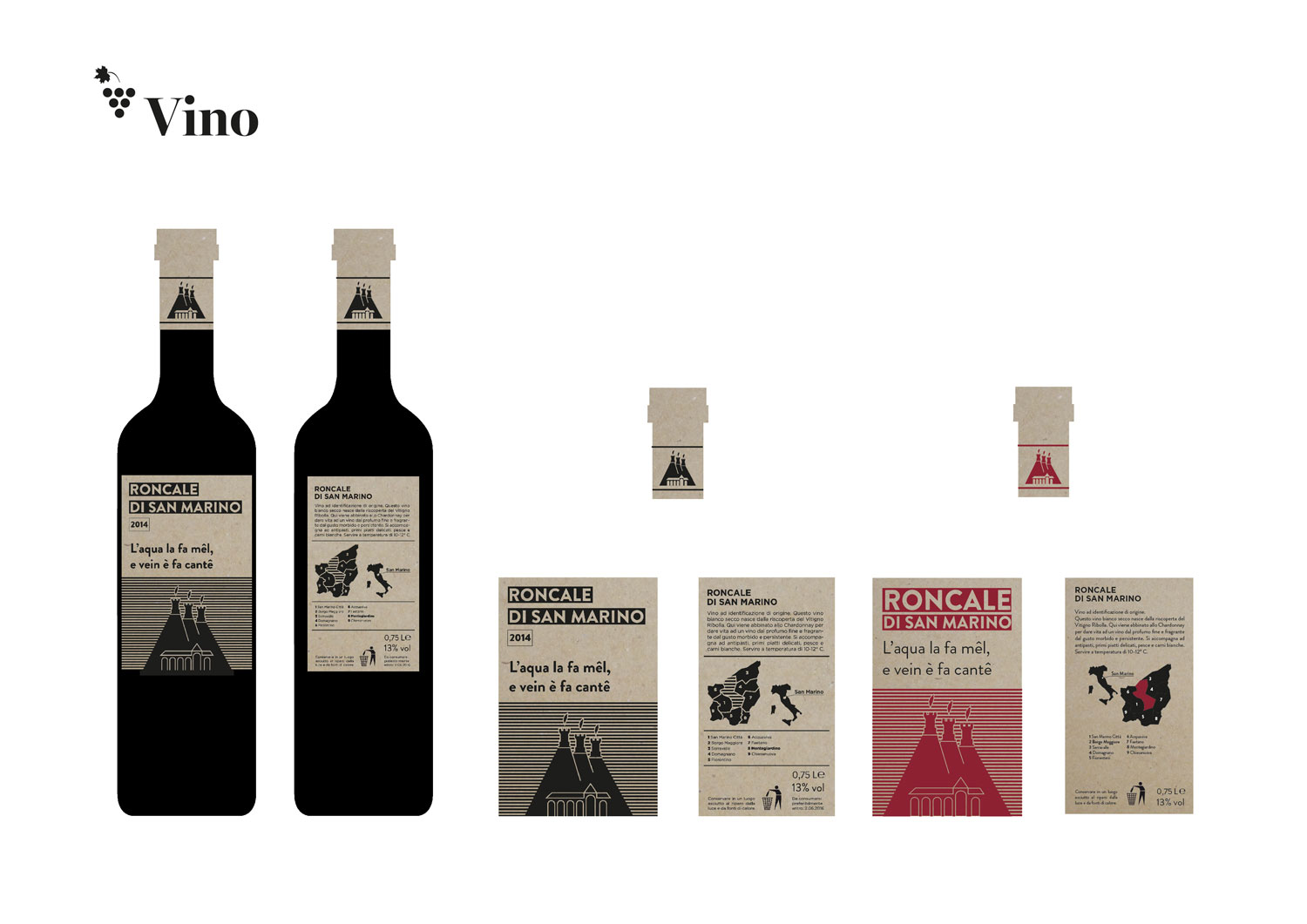
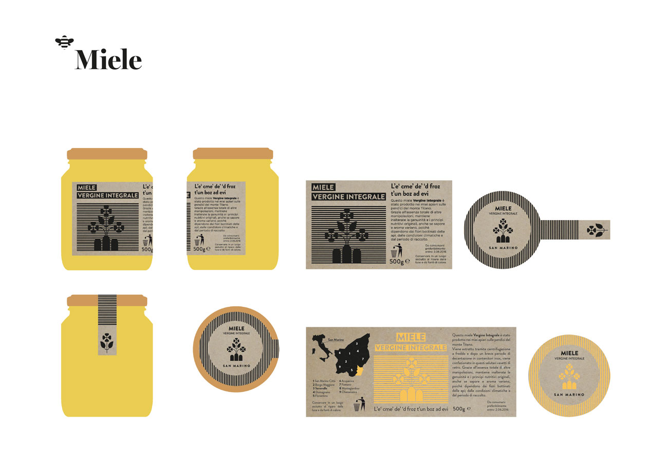
My project connects with a common graphics solution; all the typical products from San Marino. I chose to emphasize the production area within the confines of the small state. I rebuilt and modernized the old heralds that distinguish the various San Marino castles, for later use as the main element in the creation of the diverse product graphics. The labels are very simple and clean, printed in monochrome, where the second color is given from the recycled paper. With each product, I connected a dialect sentence, to emphasize the simplicity and the organic provenance of all the products. At the base of my project is the idea of family production and small businesses, where the important thing is not the big production, but the quality of the products.

